Elegant Image Studios Web Design

Creating a Brand That Reflects Growth, Knowledge, and the Great Outdoors
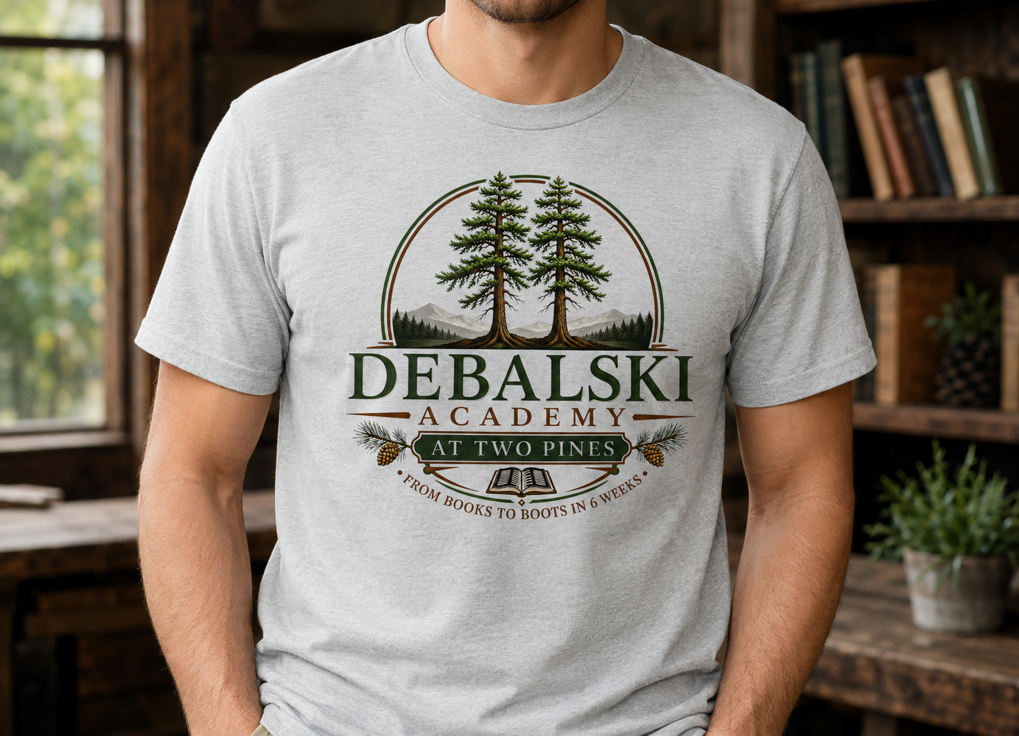
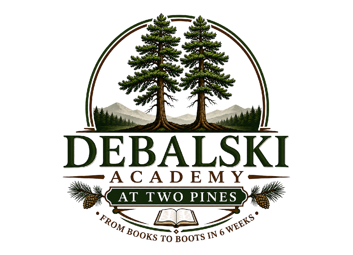
A logo should capture more than the name of an organization—it should communicate its purpose, values, and vision at a glance. When Elegant Image Studios designed the logo for Debalski Academy at Two Pines, the objective was to create a timeless brand identity that represents education, personal growth, leadership, and a deep connection with nature.
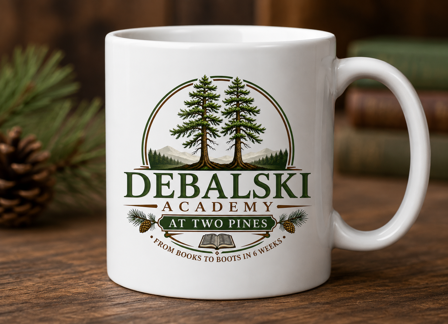
The finished design blends classic educational symbolism with the beauty of the outdoors, resulting in a sophisticated logo that is both memorable and meaningful. From digital platforms to printed materials and campus signage, the logo provides a professional identity that will represent the academy for years to come.
A Logo Designed with Purpose
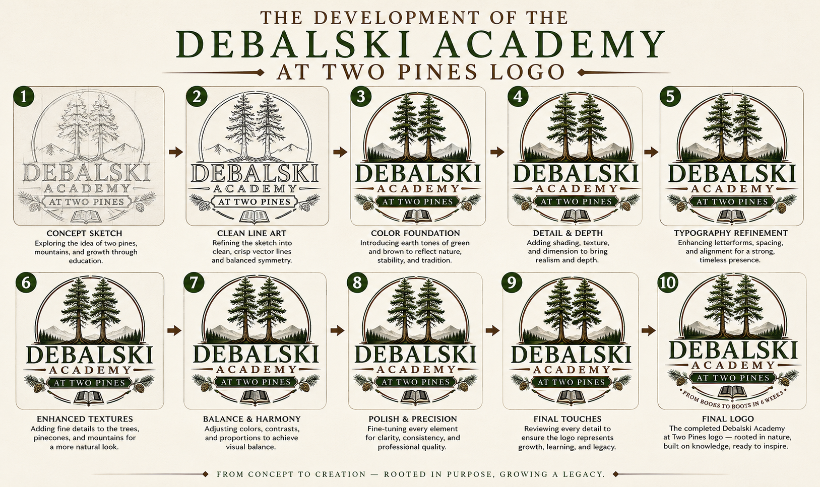
Every element of the Debalski Academy at Two Pines logo was thoughtfully crafted to tell the academy’s story and reinforce its mission.
The Two Pine Trees
The centerpiece of the logo features two majestic pine trees standing side by side. These trees represent strength, resilience, growth, and stability—qualities that mirror the educational journey students experience throughout their time at the academy. Their enduring presence also reflects the academy’s commitment to building strong foundations for future success.
Mountain Landscape
Behind the pines sits a peaceful mountain range, symbolizing vision, perseverance, and the pursuit of higher goals. Mountains remind us that every achievement begins with taking the first step and continuing to climb toward excellence.
The Open Book
Positioned at the base of the design is an open book, representing education, lifelong learning, wisdom, and opportunity. It serves as the heart of the logo, reinforcing that knowledge remains the foundation upon which every student’s future is built.
Pine Branches & Cones
The decorative pine branches and pinecones surrounding the academy name add natural elegance while emphasizing growth, renewal, and the academy’s unique outdoor-inspired identity.
Circular Badge Design
The circular composition creates a sense of unity, community, and continuity. It frames every element together while giving the logo a polished appearance suitable for apparel, signage, marketing materials, and digital applications.
Rich Green & Earth Tone Color Palette
The carefully selected shades of forest green, warm brown, and natural earth tones create an inviting yet distinguished appearance. These colors reflect the academy’s connection to nature while conveying trust, professionalism, and long-term stability.
