
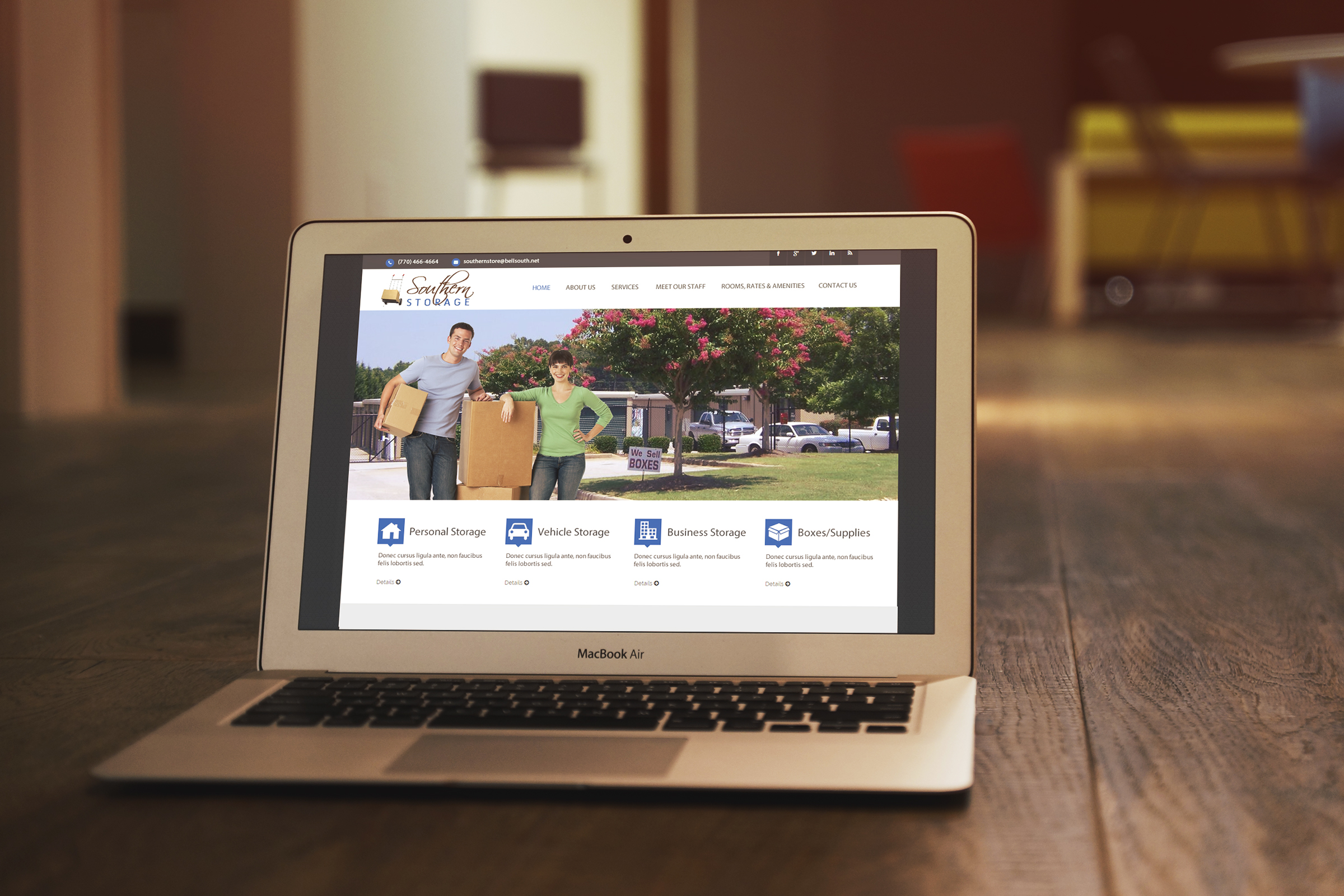
Southern Storage is a mini storage facility located in Loganville, Georgia. We actually build their current site back in 2009. Bucky, the owner decided it was time for an updated look to the site and wants a responsive site so that it will automatically re-size to any smart phone or tablet, monitor, etc. This is the first design concept we have just presented to the client which will include new SEO set up, easy navigation, layered slider to grab the site visitors attention, call to action, mobile ready, a specials and coupons page set up properly so that they will be able to update specials and coupons easily, a customized form for U-Haul rental interests, Client testimonials and more. If you own a storage facility or know of someone who is in need of a new updated storage facility site tellt hem to visit our site at www.eis2022.wpenginepowered.com or contact us today at (678) 457-7939 to set up an appointment to discuss their needs or your needs and how we can take their site or your site to the next level.
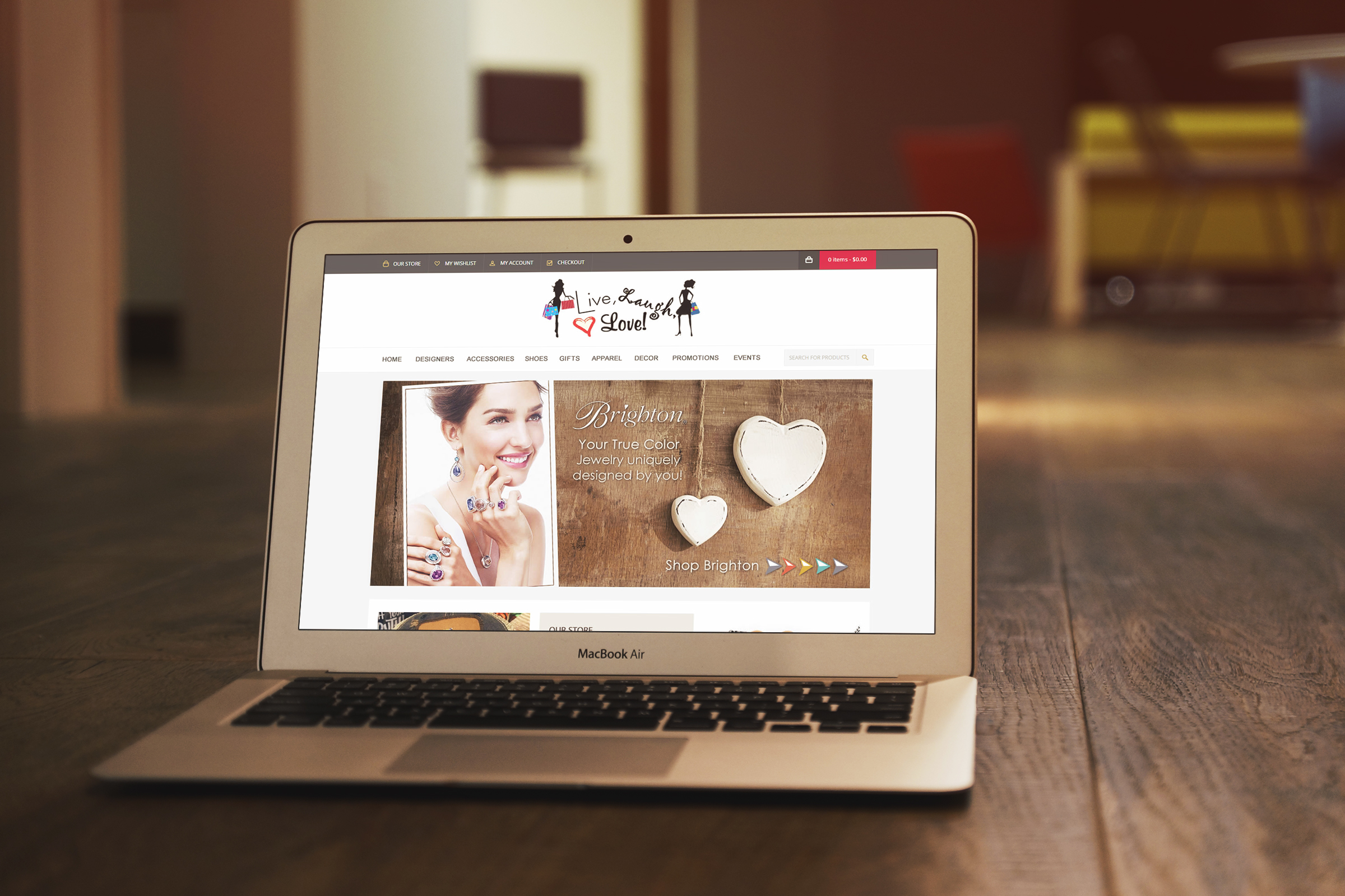
We have just completed a second design concept for Live, Laugh, Love. They are a popular boutique located in Loganville, Georgia and we first designed their current site back in 2008. We were recently hired to re-design their current site and bring it into 2014. The owner has requested a clean look. Wanting it easy to navigate, new SEO applied to the site, have a responsive site, and have a site that will be easier for maintaining themselves. Tell us what you think of this design and if you are in need of updating your boutique site or know someone who is in need of our services let us know or tell them to visit our portfolio located at https://eis2022.wpenginepowered.com/?page_id=217
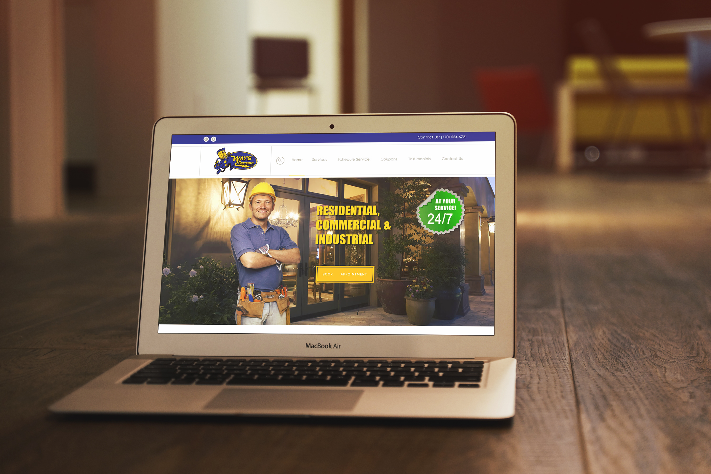
We have just completed a second website design for Way’s Electric. Way’s Electric is located in Loganville, Georgia and hired us back in 2009 to redesign their site and recently re-hired us this year to upgrade their website and bring it into 2014. They are wanting their new site to be responsive which means it will be easily viewed on all devices by automatically re-sizing. This particular site design would include a layered slider, clean design, call to action, auto posting from their blog to social media, social media link up, quick contact form, a media section, and much more.
Often times people will have a website built and think to themselves, “”I’m going to make a lot of money!” Unfortunately, that is often times not the case. You cannot build it and expect them to come. Websites are awesome for marketing any kind of business. Large or Small but the problem is, potential customers have to find your site first. If your site lacks traffic, you are not doing the following things. SEO (Search Engine Optimization) Take a moment and think of search engines like phone books. People use them to find what they are looking for. Your website needs to be optimized for specific keywords to be listed in the top search engines. Most consumer will only search the first page for products and services and getting on that first page can be a real challenge. However, if you choose the right keyword with the least competition, you can get your website on the first page. This means automatic incoming traffic to your website. PPC (Pay Per Click) If you are not already using a pay-per-click campaign. Setting one up can be quite confusing and tedious. We can help. This way, if you are having a hard time getting listed on the first page of search engines, you can pay your way onto the first page. Major companies use social media networks to buy clicks that usually send users to a landing page. Landing pages allow site owners to market a specific discount, service or item for the users email address. The site owner will later use that email to send out newsletters and other promotions to try and get the user to buy something from their website. Social Media Have you included social media links and share buttons on your website? If not, you should. Social media is an effective way to get visitors to your website. Social networks are in real-time. When you post a link on a social network the clicks you receive from that link is almost instantaneously. Work on growing your social networks and create and audience that you can market to throughout the day. Blogging You don’t have any interesting content on your website and you aren’t blogging. In today’s world information is what most people are searching for. How to this and what is that. Start blogging on your website now. If you do not have a blog, you are behind. If you are having trouble figuring out what to write about, think of what your site visitors may want to know. Don’t simply blog about your business or what you’re doing. Choose topics that your visitors can benefit from. For instance if you sell cars, make a blog about car care. What can your visitors do to keep their cars in tip top shape? Those are the types of things your readers want to know. Street Advertising Even if you are an internet based business, don’t neglect to use conventional advertising. On your business cards, add your website URL and social media handles. Use branded hash tags on promotional t-shirts and coffee mugs that you give away. These advertising methods still work.
If you’ve read anything about marketing trends for 2014, you’ve probably read that social media – which has been a valuable marketing tool for the past several years – will likely lose its status as the leading avenue for content marketing. You may have also read our recent blog, The days of easy SEO, Social Media, and Content Marketing are over. What this means is that business-owners need to find new ways of successfully engaging their customers. What, exactly, is Branded Content? Simply put, branded content is content that is designed to build brand awareness and affinity, not simply to sell a product or service. Typically, branded content seeks to educate or entertain, while avoiding the “direct sell” that is the hallmark of many other marketing avenues. You want to position your company as a trusted source for information. Content is still King It’s still important to create and/or curate content that is compelling and valuable to your customers. But simple blogs and social media updates are no longer cutting it. So much “content” is created each day, that most of it gets lost in a sea of noise. And regardless of how interesting and compelling your content is, you likely need to step up your game. Creating Branded Content What will grab your user’s attention? The whole purpose of branded content is to be useful and/or fun for the intended user. A good example of this is Blendtec’s “Will it Blend?” series. These videos have become hugely popular, and introduced me to a brand I had not heard of before. Has the popularity of “Will it Blend?” translated into increased sales for Blendtec? According to a case study, Blendtec’s retail sales increased 700% as a result of the campaign. How will you disseminate the content? I mentioned the “Will it Blend?” video series as a good example of branded content. Obviously, this was an idea well-suited to YouTube. But it’s important to be open to a medium that’s compatible with your brand. In other words, don’t automatically focus on a video series or an app – brainstorm and see what you come up with organically. What kind of options do I have? Blogs, YouTube channels, and mobile apps are the primary content branding tools. But the possibilities are open – you may be able to find an avenue that nobody else has thought of. Whatever you do though, make sure you are consistent. If you decide on a mobile app, then neglect to keep it fresh, it’s not going to give you the results you want. Make sure you are always serving your brand Branded content must serve both your customer and your brand. Again, it’s not a direct selling tool, but you should always be focused on creating a positive image for your brand.

Search “website launch checklist” and you’ll find plenty of good advice online. But there’s less if you’re looking for real-world advice on what to consider when you’re relaunching a redesigned website. Pitfalls and “gotcha”s abound, and many can significantly impact your natural search engine listings. 1. Make sure your highly indexed content is replicated accurately It seems like a no-brainer, but we’ve seen this key element neglected far too frequently. Review your analytics and make sure your top 50 (or more) pages are replicated under your new site. That is, make sure your page headings are the same: the title tags, the keywords, the images, etc. You want the content of the page to be as similar as possible – if not identical – so that the search engines don’t see it as new or changed. 2. Add 301 redirects for your top indexed content This is crucial and perhaps might deserve to be number one on this list. During a redesign it’s unlikely your site structure or the URL paths remain identical to the old site’s. So it’s critical that you politely and correctly inform the search engines that the old links should be “re-indexed” using their new URLs. This is done via 301 permanent redirects – usually applied via your htaccess or webconfig file. It simply remaps your old url paths to their new ones while also informing the search engines to reindex them properly. This one step will almost single-handedly preserve your natural listings and page ranking during the transition from old to new design. It’s even more critical if you’re also changing your domain during this process. Seriously, if you do nothing else… do this step. 3. Inform the search engines about your change Google Webmasters Tools and Bing’s Webmaster Tools allow you a convenient way to inform each about changes to your site – from its url structure to a change in domain. By using these free tools you can preserve your natural rankings and enjoy a smoother transition. Each also provides valuable data about how the search engines are “seeing” and cataloging your site, and how you could improve the results. So you should be using them regardless of a site redesign. 4. Test and debug your site on mobile and in multiple browsers Again, you’d think this goes without saying, but it bears repeating. Make sure you test your site using various browsers, and on multiple platforms (Mac, Windows, etc.), and on mobile devices. There are excellent online resources for doing this – we personally use crossbrowsertesting.com. You can view and use your site on numerous browsers and operating systems and on emulated mobile devices. 5. We highly recommend scanning your site for vulnerabilities. If you’re working with a web developer this is most likely part of their services. Before or just after launching your site, they should perform a security and vulnerability scan using various tools or SAS options. We generally configure McAfee Site Secure to scan the newly launched site daily for approximately two weeks or more. This way McAfee can scour the site and follow even the deepest links. Any issues or concerns are addressed promptly to avoid problems. 6. Do a quick seo review / audit It doesn’t have to be an extensive seo review. But you should review each page on your site to ensure it has all the SEO fundamentals in place. A unique title tag, meta description, keywords, and one or more heading tags along with copy content. Make sure every image has a completed alt tag and, if possible, the image file itself is named identifiably and with “keyword bias.” Make sure you have an updated XML sitemap file that will be updated regularly – usually this is automatically done by your CMS. 7. Have someone proofread your content While not such a major grievance as not remapping your top content, a typo or bad grammar can be embarrassing and distract visitors from your message. And if you’ve spent money on redesigning to achieve better results or conversions, it’s worth investing some time or money into hiring a proofreader. 8. Finally, have your mother test your site Yes, that’s sounds a bit silly, but what we’re actually recommending is you have someone unfamiliar with your site or brand test your site to make sure it accomplishes and communicates what you intended. Have them visit your home page and then articulate what they think you do or sell. What your benefit is; your unique selling proposition. Then have them use the site and monitor and catalog any difficulties that will need to be addressed. This is especially important on ecommerce sites, so you know your store and checkout are working smoothing and understandably. Follow these eight simple steps and your redesign and relaunch should go smoothly. You should be able to preserve your natural listings and page rank. And most importantly, you should keep your customers happy and converting.

As they’ve done for the past decade, Pantone’s color experts have designated a signature color for the upcoming year, 2014. This year it’s a soft, subtle purple that’s a combination of fuchsia, purple, and pink. “An invitation to innovation, Radiant Orchid encourages expanded creativity and originality, which is increasingly valued in today’s society.” At Elegant Image Studios we’d agree, since we’re fond of purple tones. After all it’s one of our brand colors, though Radiant Orchid is a more muted tone. Nonetheless we look forward to experimenting with Radiant Orchid in the new year along with its complementary hues.

The online world changes daily. What’s needed to find success today is vastly different than it was a year ago, let alone five or ten years ago. Options and challenges now abound and the internet just keeps growing – so to be found isn’t as easy as it once was. Sorry, but it’s the ugly truth. SEO has more options and challenges Google rules the roost when it comes to search, so most focus their efforts on it – and rightly so. Google’s recent and ongoing algorithm updates – intended to fight search spam, content mills, and nefarious black hat SEO techniques – has been brutal. Many sites felt the sting of these updates to some degree – even if they played by the rules. Moreover, while you’re dealing with the effects of Google’s algorithm updates, you have to do it without search term data. Since Google now encrypts all search, keywords are no longer available within Google Analytics. In essence you’re now flying blind when trying to determine what people searched on to find you. Not to mention you also have to include and navigate local search and mobile search and the world of social media as well. Social Media now favors paid promotion Social media allows near real-time communication among family, friends, and folks worldwide. You can quickly check the opinions or reviews of dozens, hundreds, or tens of thousands about anything. You can rant and vent online. You can watch events unfold from personal perspectives unfiltered by mass media. And best of all, it was focused on your interests – your friends, who you followed or liked. It was revolutionary. But shortly after the “big guns” offered their IPOs things started to change. It was inevitable. As venture capital is replaced by investor capital the focus changes from growing subscribers to growing revenue. And so social media has veered towards paid promotion. Algorithms now limit what you see on Facebook and reduce the reach of your posts – even among your friends and family –unless you pay to promote them. And it’s worse for companies and small businesses. Even Twitter now injects sponsored posts into your feed. It’s not going to get better. As each social media company nears or offers an IPO, it will gradually be forced to find a revenue stream – and this generally means advertising. And to pump up ad rates you have to ensure people “need” to advertise to be seen – so attenuating “reach” forces it. Content Marketing is drowning itself Content marketing is basically the term coined to cover any activity that generated “original content” with the purpose to grow your natural search listings or social media reach. Write a blog, create a video, make an infographic, or produce a podcast – it’s all content that’s probably marketing something. Content marketing worked until it didn’t. Well, it still works… it just takes a lot more effort. And the problem is that huge companies have popped up that generate humungous volumes of content – even after Google clamped down on content mills in their last updates. The difference here is that Buzzfeed.com, Mashable.com, Cracked.com, and similar companies all generate content that’s consumed, shared, and that tends to go viral. These companies “each” generate 10, 20, 30 posts per hour, flooding social media with them (via subscriptions and Likes and Shares). This translates into thousands of posts, videos, and/or infographics every single day flooding the world with content. And don’t forget, every other business is also being “advised” to create content too. So how is your business blog that posts once per week (if you’re lucky) suppose to be found and succeed? So what should you do today to compete? First, don’t try to compete with the Buzzfeed.com’s of the world. Focus instead on connecting with and resonating with your customers and prospects. Generate content that is relevant, interesting, and genuinely helpful to them. Don’t play the game of generating lists and aiming for quantity over quality. It’s a vicious downward spiral that generally doesn’t end well. If you’re only able to write a blog post or create a video or podcast once per week or once per month – that’s OK – provided it’s good content. Don’t just create something to get it done – spend the time to create something that your audience will enjoy. Second, if you’re creating content that’s focused on helping your customer or prospect, it should automatically align with what they’re searching for online. Not that this guarantees good natural listings – but it’s a good start. And the longer you continue and the more good quality content you create around related topics and key phrases, the better your results will be. It just might take time. Of course if you need faster results you can certainly invest in SEO services or budget for online ads. Third, as for social…again if your content is interesting, helpful, and focused your audience will likely share it or recommend it. But it also helps to make it easy for them to do so. Add sharing links/buttons to your content. And don’t be ashamed to ask… adding a line such as “if you enjoyed this post share it on Facebook or Twitter” can help. Make sure you’re also active and engaging on social too. Don’t just push out your own content – try to find other “helpful” information and share it too. Your audience will appreciate it and you’ll stay “connected” with them. And be ready to respond to questions or comments on whatever social channels you’re participating. Remember, social is about being social. And yes, if you need faster results and can afford to, you can also explore ads and promoting posts. What you shouldn’t do What you should avoid is the delusional concept that SEO, social media, and content marketing are easy and cheap. That may have been partly true when each was in its infancy and the early adopters found easy success. But things are
According to comScore, as of May 2012, smartphone ownership reached 110 million users. To put it another way, about 55% of all US mobile phone owners, are using a smartphone. And the trend isn’t going away. By mid 2013, I’ll safely predict the number will be nearly 75% if not higher. So how’s a higher percentage of smartphone ownership translate into 2013 being the year the web goes mobile? Isn’t it already mobile? I’ll answer the second question first. Yes, the web is mobile now. But it’s not generally optimized for it. While standard sites will usually work on phones and tablets – newer web technologies are making it easier for web designers and developers to create sites that work on computers and work even better in mobile environments. And while these tools existed during 2012 and are maturing rapidly – it takes time for both web designers and businesses to become comfortable with them. Not to mention, in 2012, not every business was ready to invest in retooling their website so it was mobile optimized. In 2013 companies will feel the pressure to truly embrace mobile As the economy continues it’s glacial “rebound” companies will again start to spend – including on web redesigns. The smart businesses will embrace mobile and all it’s devices and resolutions by adopting responsive web design. Responsive web design is the solution many have been looking for in the web design world. Instead of building multiple sites that correspond to each device (and their resolution) the site is designed so it’s adaptable to whatever device or screen size & depth it’s being viewed upon. Responsive web design isn’t perfect….and it has its detractors. But it’s our experience that it takes less time to design, develop, and deploy a responsive site then it does to create multiple site designs for various devices. And as the responsive frameworks improve and designers begin to better understand and adapt their thinking – the development process will exponentially improve too. If you’re a small business, think mobile in 2013 So if you’re a business that’s launching or redesigning a website in 2013 – make sure you’re focusing on mobile. More and more of your users will interact with you via their smartphones, tablets, or whatever is next. So make sure your site is ready for them or you’ll be left behind in 2013 – they year the web truly goes mobile.
