
We’ve all heard the old cliche – less is more. But, is it really true? When it comes to web design, the answer is yes. Simple website design offers benefits that more complex websites can’t match. While you may like the look of elaborate designs, when designing for function simplicity will win out every time. Digital marketing expert Neil Patel points out: Far too often I see websites try to jam too much information into a very small space. The navigation is confusing, and it’s overwhelming for anyone viewing the site. If this is starting to sound like the layout of your website, it could be the reason why your conversion rates are unsatisfactory. Even if you don’t think your design is too cluttered, there’s always room for improvement. Taking the time to streamline your website will create a better user experience and serve your business better. Here are 5 important benefits of simple website designs: Simple websites convert better. Simple web designs load faster. Simple designs are more mobile-friendly. Simple websites cost less. Simple websites reduce user friction. Let’s take a look at each of these benefits to see how you can make it work on your business website. Simple Websites Convert Better. The website landing page is a specific type of webpage whose entire purpose is to convert. The golden rule of designing a landing page that converts well? Keep it simple. Simple design makes it easy to draw the viewer’s eye to the most important area of the page – and, if you’re looking for conversions, that’s your call to action. Navigating a cluttered interface is no fun. It can be confusing, overwhelming and frustrating. And, it makes it harder for users to find and complete a call to action. Here are two easy ways to simplify your web design to improve conversions… Limit Your Menu Options It can be tempting to show your audience everything you have to offer right off the bat. But, that may not be the best choice. You want your website to be informative and user-friendly. But, offering too many navigation options is more likely to overwhelm your viewers than it is to help them. You’ll see conversions increase if you limit your menu options to just the essentials. A menu full of intriguing destinations on your website many entice viewers to click in deeper before they have a chance to act on the call to action right in front of them. Conversely, users may be paralyzed by a wealth of menu options and subsequently click away entirely if they don’t see what they want right away. The more menu options are present (and the more information your viewers have to sift through), the more decisions they have to make. And, decision fatigue is a real threat to your conversions. Psychologist Barry Schwartz, the author of The Paradox of Choice, points out: The more options we have, the less likely we are to make a choice because we’re paralyzed [with indecision]; or, if we overcome paralysis and make a choice, we tend to be less satisfied with our choice later. The bar [for obtaining satisfaction] rises with the more options people have to choose from. Make life easier for your audience by giving them as few navigation decisions to make as possible. And make sure the decisions they do have to make really count. Focus Attention on Your Call to Action The more opportunities you provide on your website to buy something, sign up for emails, or subscribe to your blog, the better… Right? Wrong. Pulling your viewer’s focus in too many directions at once will decrease the likelihood that they will actually act on any of those opportunities. (Decision fatigue – remember?) Simplify your web page and increase your conversions by eliminating anything that may draw focus from your call to action. In fact, go one step further, by using the design elements to guide the eye directly to the CTA. If you’re aiming for strong conversions, make your call to action the primary focus of your webpage. You should, of course, feel free to promote multiple offers on your website. But, limit each offer to its own page so that it can get the attention it truly deserves. Simple Website Designs Load Faster. Website load speeds are vitally important to the user experience; and, as a result, to your business. Did you know that viewers start abandoning your website after mere seconds of load time? Between seconds 4 and 5 of your website’s load time, 20% of viewers have already left your site. The number only increases from there. And, not only that, search engines take your website’s load time into consideration when calculating your ranking. A faster load time means a higher placement in the search engine results. If you want to optimize your website for speed – which you should – complex web designs are the enemy. So, pare back complex graphics. Simplify elaborate layouts. Minimize your photos and graphics to speed up load times. Trim your copy and compress your video files. Faster load times keep viewers around longer, create a better user experience, and increase the likelihood that viewers will even find your website in the first place. Simple Designs Are More Mobile-Friendly. As of 2017, 63% of all web traffic took place on mobile devices. This means that how your website looks on mobile is just as important – if not more so – than how it looks on a laptop or desktop computer. Simple web design is easier to translate into a small mobile screen than a busy, visually complex design. This may be one of the most compelling benefits of simple design – with so much web traffic via mobile, creating ease-of-use for mobile users is a no-brainer. Sure, you could maintain two websites – one for desktop and one for mobile. But, that requires twice as much work. It’s far better to have one simple responsive design that can easily transition from laptop to phone to tablet while maintaining the design’s integrity. With fewer moving pieces to juggle, simple websites with limited design elements are just naturally more flexible.
As you dive into the world of digital marketing, you’ll likely encounter a whole new vocabulary and set of concepts. If you haven’t already, you’re bound to have questions about how landing pages fit into your digital marketing strategy. Developing a landing page sounds like a simple task, and it can be, but it’s vitally important to lead conversion.
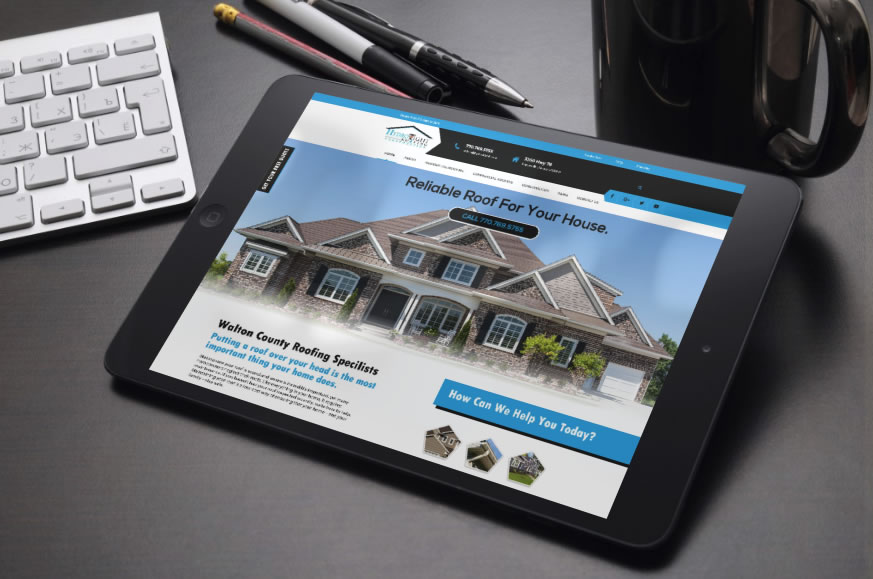
We Welcome Hydro Tight Roofing & Restoration to the EIS family! Hydro Tight Roofing is a family-owned roofing & restoration company located in Loganville, Georgia. They are members of the National Roofing Contractors Association, Master Shingle Certified through CertainTeed, with outstanding reviews on both Kudzu and Angie’s List. They work with new construction, developers, home builders, and homeowners. After taking a look at their current website you will see below we came up with some problematic issues that we wanted to focus on and correct in the newly designed and developed website. The logo looks like it’s just been slapped on the website. It does not blend in well with the site design/layout Load Time – Every single page takes a while to load. 14seconds is what the load time on a 3G service is which is poor and leads to 32% Estimated visitor loss. Navigation is difficult to read No call to action up top Facebook links to the incorrect Facebook business page Google+ links to the incorrect google page Sections on the home page are just plain and not eye-catching. The gallery of work does not show past jobs. Frequently Asked Questions is text-heavy. The service Area page is not professional looking. Favicon is not correct. Top Fixes For the site Load visible content before CSS and JS – If the amount of data required exceeds the initial congestion window, it will require additional round trips between your server and your visitor’s browser. To make pages load faster, limit the size of the data that is needed to render the above-the-fold content of your page. Optimize Images – Images often account for most of the downloaded bytes on a page. Properly formatting and compressing images can save many bytes of data and improve website performance. Leverage Caching – Caching allows a browser to store frequently requested files on the user’s device for a set period of time. When caching is enabled, subsequent page loads can be more efficient. Performance graded at 12 out of 30 – Page requests are 117 which makes the site slower. SEO – Page titles need to be fixed. Scored 20 out of 30. Security graded at 0 out of 10. No SSL certificate means Google does not give good rankings to site without an SSL certificate. Make a call to action. Incorporate a rewards program. Make the site stand out and draw users in. Make a Favicon that is relevant to your business. Show your work in a professional easy to maintain layout. Share the latest news in a blog to help keep fresh content on your website. Add social share buttons on each page. Brand social media to mirror your website. Our Design Presented to the Client
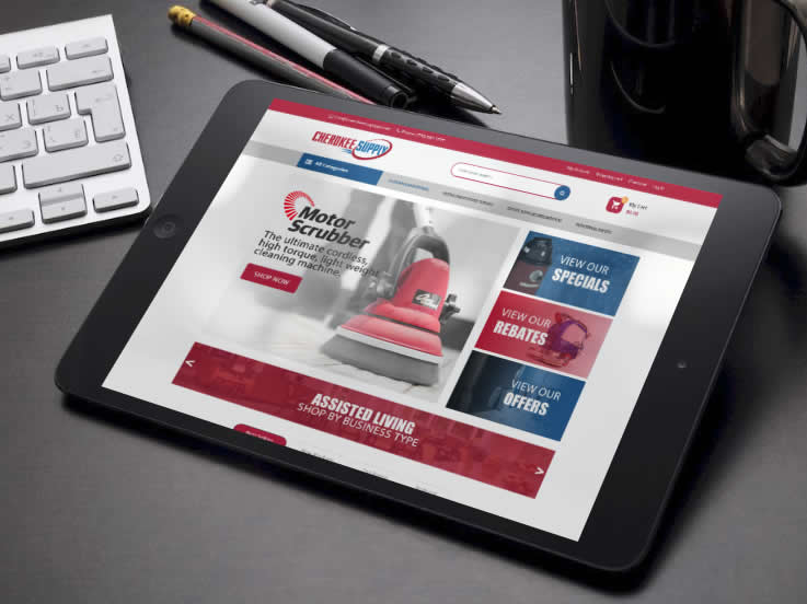
In 2001, Cherokee Supply initially offered janitorial & breakroom supplies that met the immediate needs of their customers. Today, they have expanded their product offerings to include office supplies, facility maintenance needs, and safety products. To keep up with the changing marketplace are developing a new website that will help serve needs of their customers. This will be a full-service website with over 30,000 items available to existing and new customers. To provide quick and efficient access to customers across the United States, CherokeeSupplyGA.com brings a network of over 35 distribution warehouses to one site. Here are some other features we could apply to the site if needed once it’s moved over to the development phase. Mega Menu – Great for the navigation menu and the Categories menu to show links in a nice and neat format. Blog Module – Help customers understand more about your site and your products via a blog. (this can be found in my design concept) Products slider – All types of products (new, featured, best selling, discount, most viewed) are displayed in a slider with a nice design with smooth effects. This can be found in the design concept if you see the circles with arrows under the products right above Latest News) Daily Deals – Display countdown time in every special product page or slider on the home page. Easy to configure within the dashboard. Categories Tabs Slider Ajax Add to Cart Responsive and Retina Ready – All functions of your site will be viewable on almost every device. Desktops, Laptops, ipads, iphones, tvs, samsung. (though sometimes Apple products tend to have bugs so we never guarantee not having issues with apple devices) Product Variants – Allow you to create products with many attributes such as color, size, material, etc. Custom Banner Slider – Simple effects but equally smooth with module slideshow. Brand Logo Slider – you will see this on the design concept at the bottom. Newsletter – Display newsletter form on in the footer or the site which can be easily configured with MailChimp. WordPress 4.8+ Ready WooCommerce Ready – (shopping cart) WPML Supported Social Icon Links Error 404 page Visual Composer – makes editing and maintaining your website easy. Contact Form 7 – Form plugin used on the site once developed.
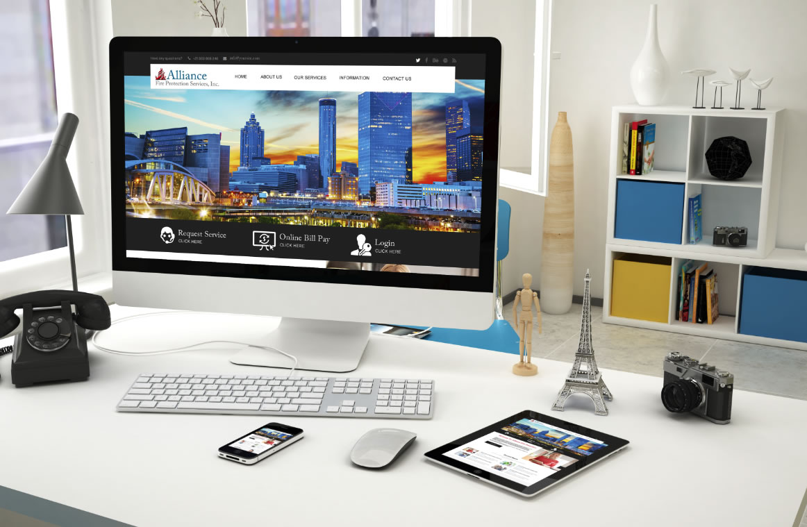
Alliance Fire Protection Services, Inc. is a full-service life safety company servicing the Metro Atlanta area. AFPS specializes in inspection, service and tenant modification of existing fire alarm, fire sprinkler, fire suppression and low voltage systems to include fire hydrants, fire pumps, backflow preventers and monitoring of fire alarm systems. With Alliance Fire Protection Services, Inc. you receive a true “full service” experience. This is a clean responsive WordPress theme. This site comes with Visual Composer – the super powerful page builder which allow you to create your site using drag-drop ability. It comes with the necessary feature for your website such as a blog, portfolio, shop, etc. You can also create parallax section in pages easily via page builder. This site is also compatible with the most popular e-commerce plugin WooCommerce and also compatible with WPML. Premium Slider Unlimited sidebars Responsive & Retina Ready SEO Friendly & more
