
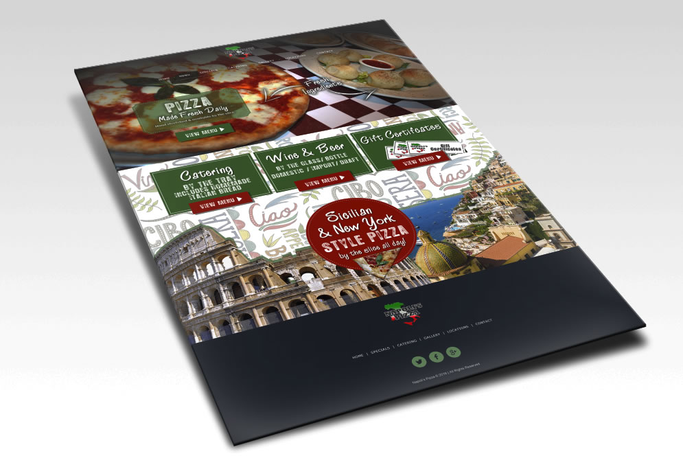
Family owned and operated, Napoli’s Pizza brings together all of the traditions and authenticity of Italian cuisine in a relaxed dining atmosphere.Napoli’s Pizza specializes in gourmet pizzas, great pastas, main courses and salads. They currently have 2 locations open in Flowery Branch & Oakwood with a 3rd location opening soon in Lula, Georgia. What do you think of this design concept?
In May of 2014, Brooke graduated from law school, earning her Juris Doctorate degree. Along the way, she interned for both criminal defense attorneys and civil attorneys in the Atlanta area. Months after graduation, Brooke sat for the Georgia Bar examination, passed the examination and is now a practicing member of the American Bar Association and the Georgia Bar. Her practice includes both criminal and civil litigation. Brooke is an active member of the Georgia Trial Lawyers Association, the Georgia Family Law Institute and the Georgia Association of Criminal Defense Lawyers.
In May of 2014, Brooke graduated from law school, earning her Juris Doctorate degree. Along the way, she interned for both criminal defense attorneys and civil attorneys in the Atlanta area. Months after graduation, Brooke sat for the Georgia Bar examination, passed the examination and is now a practicing member of the American Bar Association and the Georgia Bar. Her practice includes both criminal and civil litigation. Brooke is an active member of the Georgia Trial Lawyers Association, the Georgia Family Law Institute and the Georgia Association of Criminal Defense Lawyers.

Adam Stein has spent more than 8 years serving clients’ legal and financial needs. Their office puts this expertise to work for their clients every day, providing solutions in the following areas: Collaborative Law Juvenile Law Family Law Alternative Dispute Resolution Bankruptcy
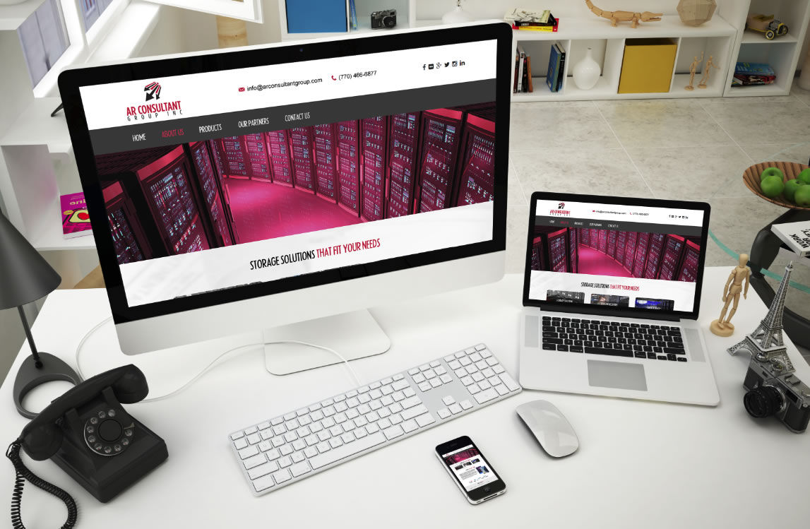
AR Consultant Group prides itself in their ability to take the complex and the sometimes confusing subject of data storage and craft specific solutions for its customers that fit their data needs and cost structures.
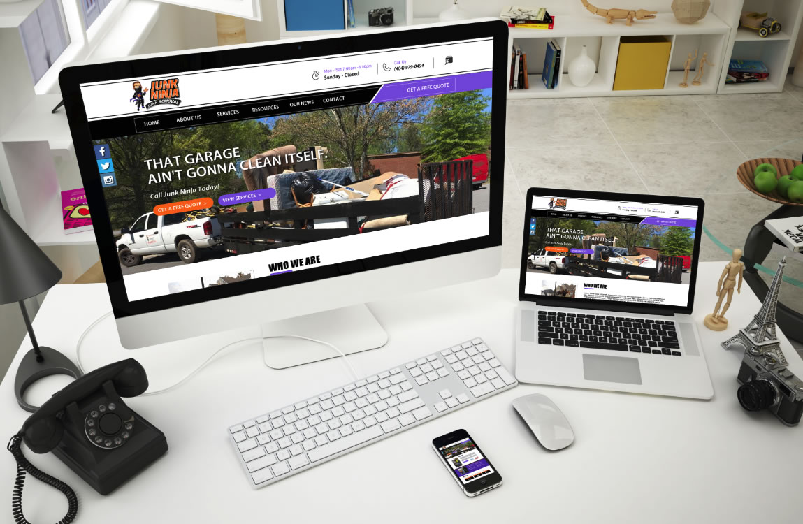
We would like to welcome another new client to EIS. Junk Ninja located in Kennesaw, Georgia. Junk Ninja Junk Removal offers a variety of junk removal jobs. They work all over the Atlanta area providing trash removal for local residents and businesses. If you would like to find out how we can help you get rid of your junk give them a call.
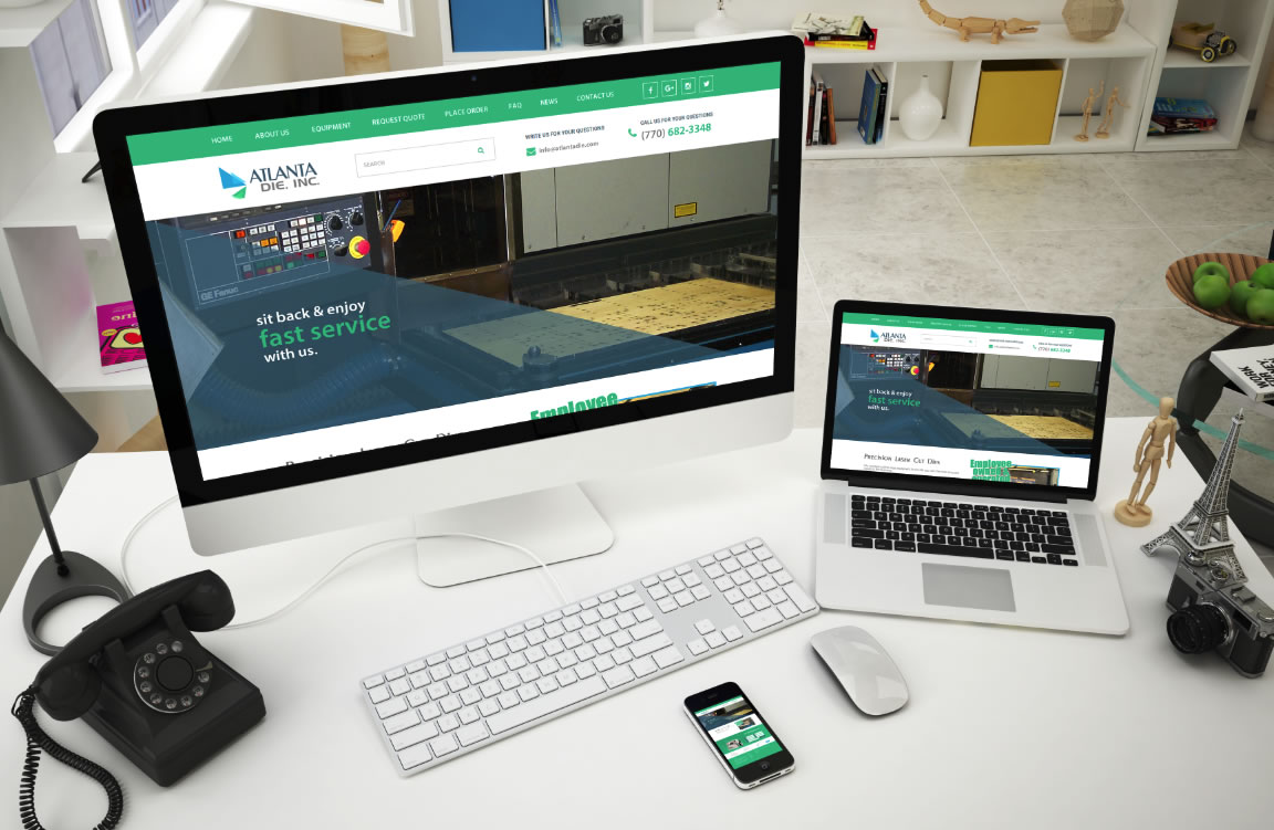
We welcome our new client Atlanta Die, Inc. Since beginning operations in 1984, Atlanta Die has provided steel rule cutting dies and associated tooling for the paperboard, corrugated, plastics, label and gasket industries. Their employees offer over 236 years of experience in the Folding Carton and Commercial Printing Industries including sheet fed, hand fed and web fed die cutting, stripping and blanking as well as structural design and mechanical packaging applications.
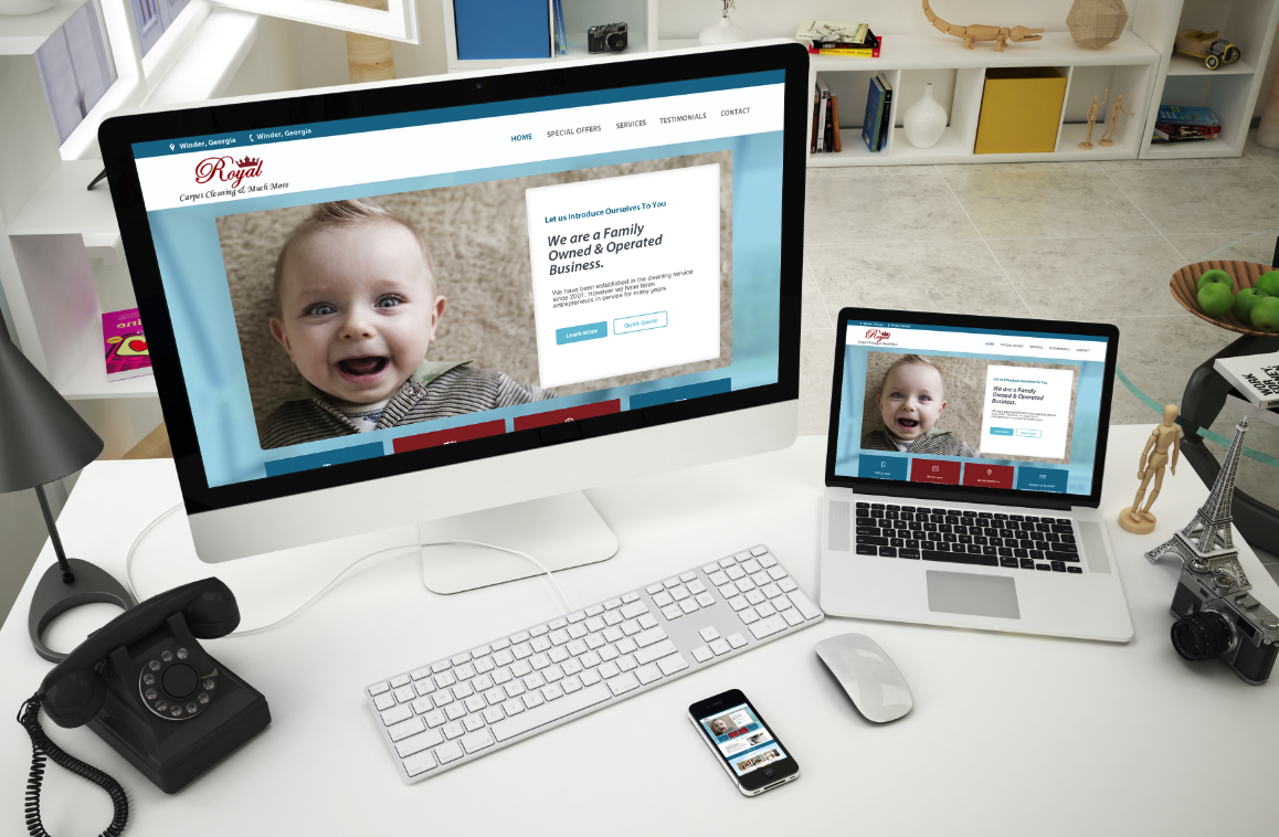
Royal Carpet Cleaning is a Family Owned & Operated Business. They have been established in the cleaning service since 2001; However they have been entrepreneurs in service for many more years.

The world of Web design moves quickly, and as always, it’s in a designer’s best interest to stay ahead of the curve. If I suggest something to clients it isn’t because it is the now but because it will be the NOW. The Confluence of Design Despite having more design options and greater technological flexibility, most Web designs are starting to mimic each other. How many times have you seen a homepage with a big, bold, yet simple white text on a darkened or blurred-out background? It is ridiculously common. Is it because people prefer to copy old ideas rather than come up with new ones? Is it because it’s simply the most effective design from a marketing perspective? The answer to both questions is probably yes. Either way, enterprises will face a difficult decision to either run with the crowd in the established grooves of Web design or go it alone in some bold, new direction. Long Scrolls When I hear clients request no scrolling I am always confused. Especially with your home page being your most important page of your site. Folks will scroll much better than click so think about that a bit. Thanks to the ease of scrolling on mobile devices, long scrolls have cemented their position as a necessary web feature. This feature stands to become ever more popular. Increasing Minimalism This is been a dominant theme in design for the past several years, but especially on the Web. Phrases are getting shorter, navigations are getting narrower, pages are getting smaller in numbers, and images are getting less obtrusive and more suggestive. Saturated and Bright Colors I am not talking about colors that will hurt the eyes or cause reliability issues. Colors are my thing. If I suggest colors vs. the colors you are wanting to use it is for a reason. I am always thinking about what the majority will like not what one person will like. Friendlier Loading Options Nobody likes to wait for a page to load. Page loading times can not only negatively impact Google search rankings, but also ensure visitors leave without accomplishing their goal. Less Dependence on Clicks Clicks used to be the ruling force in the world of Web design. Getting a user to click on a website element was akin to securing a real interaction, meaning a site was effective in this specific instance. Which takes us back to Scrolling. Love the scrolling vs. the clicking. Social Media Icons Must have on every website. I could go on and on about this but the fact is every business needs to be on social media. Don’t have time? Make time. There are online scheduling services you can sign up for.
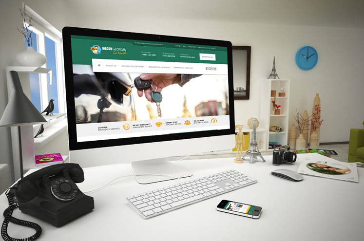
We can effectively design, build and even manage PPC marketing campaigns for Locksmith companies to help generate consistent locksmith leads for your business. Your website design is more important that your physical location when making first impressions. 81% of US internet users are using search engines to make spending decisions. Is your website outranking your competitors? Investment in SEO & Online Marketing produces 8x greater ROI than traditional advertising.
