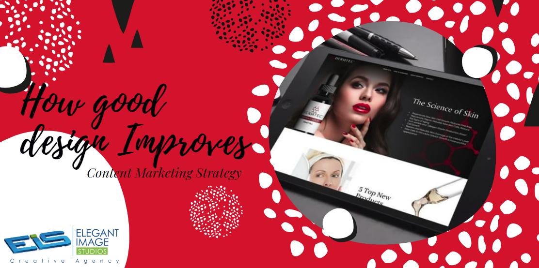
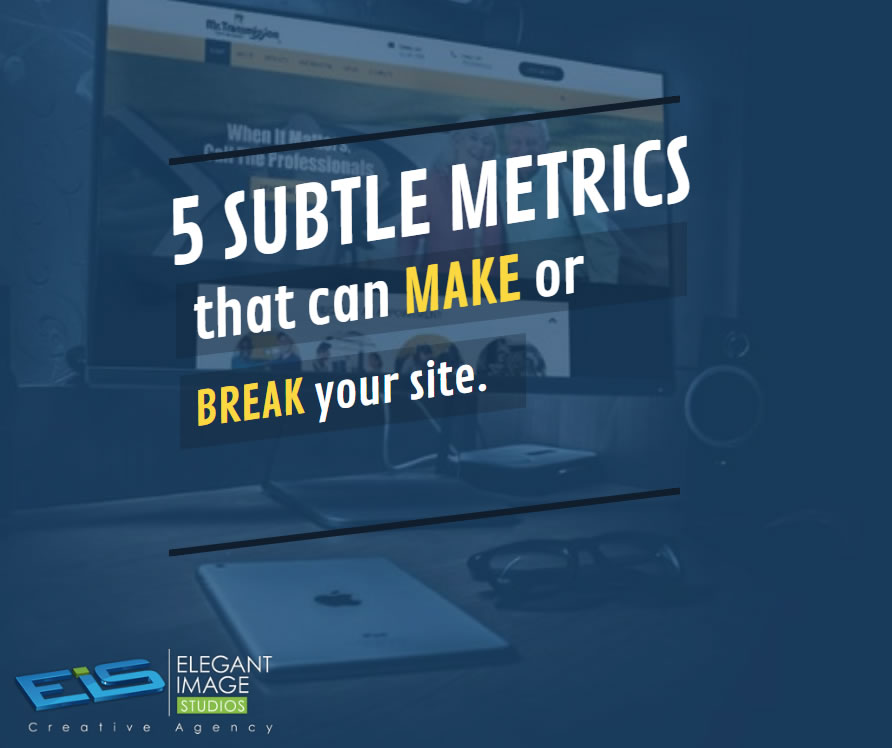
If your small business is trying to leverage social media for marketing, you’re probably struggling to build a large, engaged audience. You’re not alone. Every 60 seconds there are 293,000 new posts and 136,000 new photos posted on Facebook alone. Businesses need to leverage every strategy and tactic they can to effectively market on social media. One of the most important strategies: investing in good design to amplify your content marketing strategy. Here are five proven ways good design can amplify your content marketing strategy. Good design is memorable Good design builds brand recognition Strong visuals perform better than text alone Good design effectively uses limited space Images attract more clicks, retweets, and likes Good design is memorable As we wrote in Why Good Design is More Important Than Ever for Your Business: People have a very short attention span. In fact, according to a Princeton University study, snap judgments count. The study found after seeing a face for only 1/10th of a second people formed opinions about that person. Judgments were made on attractiveness, likeability, and trustworthiness, and prolonged exposure to that face just reinforced the initial impression. With the incredible amount of content the average user encounters on social media, first impressions and snap judgments play an important role. Research has found the attention span of the average adult has dropped to a mere 8 seconds. When you have so little time to catch the attention of social media users, good design becomes even more critical. Good design builds brand recognition Colors, type, imagery, and layout contribute to the visual essence that makes up a brand. These things are also vital components of good design. Think about ways to incorporate elements from your brand in your content marketing. Whether it’s a splash of color, the use of your corporate typeface, or an element from your logo subtlety integrated into the background of an image, there are many ways you can add your brand in without overwhelming the content. For more on logo design, give us a call today at (678) 457-7939. People remember visuals better than text Scientists have found that people’s ability to recall images is dramatically better than remembering text alone. They even coined a cool name for this phenomenon: the Picture Superiority Effect. Inc. magazine explains: It works like this: If you hear information delivered verbally, you are likely to remember about 10 percent of that information three days later. Add a picture, however, and your recall rate will soar to 65 percent. Put simply, visuals matter—a lot. “Human PSE is truly Olympian,” writes molecular biologist John Medina in Brain Rules. “Tests performed years ago showed that people could remember 2,500 pictures with at least 90 percent accuracy several days post-exposure, even though the subjects saw each picture for about 10 seconds. That kind of recall is even more critical when you consider the deluge of content people scroll through every day on social media. Incorporating images with good design is a powerful way to extend your brand. For example, if you’re showcasing your products on social media, be sure that you have strong packaging design (the physical packaging for your products) and package graphics (the graphics, including images and content, on the packaging) so that your products stand out. 74% of social media marketers use some visual asset in their post and marketing, and 37% of marketers said that visuals were their most important form of content. Only blogging rated higher. Good design effectively uses limited space According to recent studies, an incredible 80% of the time on social media is spent using mobile devices. This is a problem for communicating with customers and prospects because post and image sizes on many social media sites are quite small: Instagram posts are resized to 612 pixels by 612 pixels. Facebook and Twitter feed images end up just over 500 pixels wide. Good design can help boost your content when you’re working with a limited amount of space. How something is organized visually and how well it’s perceived is primarily informed by psychology and how our brains interpret what we see. Less can be more. Good design encourages sharing Marketing studies reveal a staggering statistic: the average American is exposed to around 5,000 advertisements and brands per day. Only twelve ads leave an impression. Want to be like those twelve impressive, spotlight-stealing brands? You need a practical, attractive design. When consumers are faced with deciding between a wide array of choices – all things with similar features or benefits – they go with the one that they either recognize or the one that has a more pleasing design. For example, images attract more clicks, retweets, and likes According to research conducted by Buffer (a social media tool we use and like), tweets with images received 150% more retweets than those without any images. Customers aren’t the only ones that agree good design helps companies on social media platforms. 60.8% of marketers said that in 2017,the design was essential to their marketing strategies. 93% agreed that it was very important. By leveraging good design, you can ensure that your content marketing efforts won’t be another momentary blip in your customers’ endless social media stream. Article from: https://www.websitemagazine.com/blog/how-good-design-improves-content-marketing-strategy
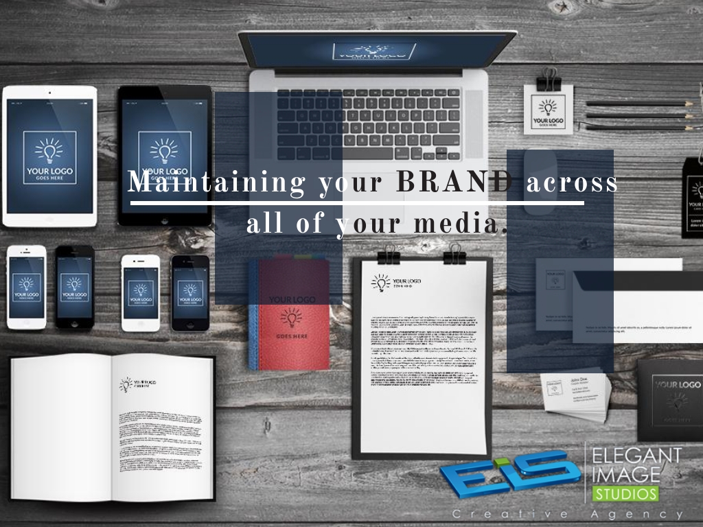
With our Corporate ID Package, we can design your business cards, letterhead, and envelopes to mirror your website thereby maintaining your brand across all of your media. Call (678) 457-7939 or visit us online today at https://goo.gl/Bwq3DI #EIS #ElegantImageStudios
A well-maintained website attracts new customers and maintains the interests of existing customers. Call (678) 457-7939 or visit us online today at https://eis2022.wpenginepowered.com/services/website-maintenance/ #EIS #ElegantImageStudios
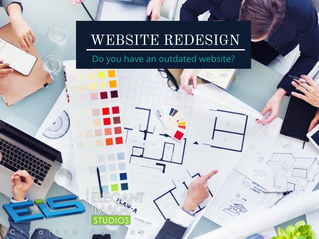
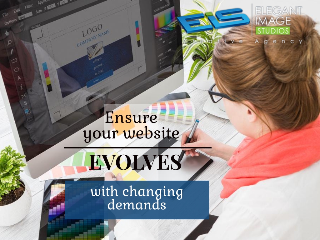
It may be time for you to think about a redesign of your current website. Call (678) 457-7939 or visit us online today at https://goo.gl/Bwq3DI #EIS #ElegantImageStudios
Check Your Links Few things look as amateur as links that are no longer relevant, or don’t work! Every so often, go back and click on every link on your website. Every. Single. One. If you link to outside sources of information, you need to check to make sure they’ve not been broken, removed, moved, or simply been eaten by some computer error. 2. Update Your Content Out-of-date content doesn’t look great. If you have a brochure site for a small business, and the prices are not often subject to change, it can be fine to mostly leave the content alone. But if you have any sort of blog, media feed, or what-have-you: keep it up to date. 3. Test on New Browsers and Devices When a new browser comes out, test your site. If your friend gets a new phone or tablet, ask to borrow it so you can test your site. A new version of JavaScript comes out? Test your site with it. Get a new TV that can browse the web? You get the idea, I’m sure. 4. Double Check All Javascript Interactions This is actually a big one. So many sites rely on JavaScript for basic functionality. Large swathes of content and even entire websites will stop working if their JavaScript stops working for any reason. 5. Double Check All Forms Forms can stop working for a variety of reasons. Whatever the reason, check the forms regularly, so you don’t lose business. 6. Update All Hacks and Workarounds Sometimes when others build websites they may use hacks. Workarounds. But browsers get updates, browser market saturation changes, and CSS gets updated too. Whenever you hear of any changes that might affect your site you should check to see if any of your workarounds are now obsolete. 7. Have a Backup Plan Have a plan for backing up your entire website. any decent web host should be handling backups for you. If not, contact us today. Article from: https://www.redinfographics.com/7-things-check-website-every-month/
A new website should be an opportunity to improve SEO, conversion rates and digital marketing as a whole. Unfortunately, it can also be an invitation for disaster — if the right steps aren’t taken to ensure a smooth transition from old website to new, you can damage the SEO equity your site has worked hard to build over the years.
SEO mistakes can be devastating to a website’s placement in the SERPs (Search Engine Results Pages). Whether you have a new website or you have had your site up for a long time, this article is for you.
Not keeping track of your website’s metrics, or doing it but not taking action based on what you find, is more or less equal to walking around in pitch darkness hoping to somehow reach your destination: both are possible but highly unlikely.
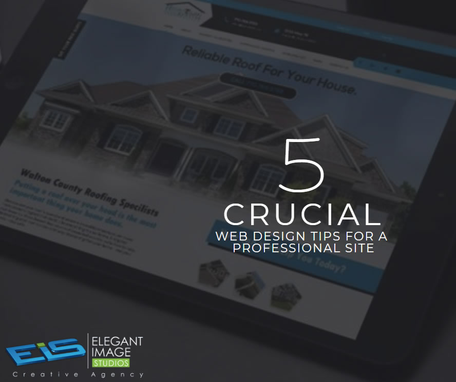
01. Keep your homepage minimalistic and free of clutter We rarely read every word on a website. Instead, we quickly scan pages, picking out keywords and sentences. With these known behaviors in mind, it’s better to appeal to emotions rather than word count. The less someone looking at your site has to read, click on or remember, the better they’ll be able to process and evaluate what’s going on in front of them. That makes it more likely for them to do what you wanted them to do in the first place. Text and Calls To Action are necessary, of course, but make sure to break them up into larger subheadings and legible paragraphs. We also suggest using images or icons as alternative ways to communicate your point. 02. Design with the visual hierarchy in mind We’ve come a long way from stone tablets. With computer screens and smartphones, as the technology to display information evolves, it remains the designer’s job to arrange the content in a clear manner. You only have a few seconds to grab someone’s attention and tell them what your site is about. If you establish a clear hierarchy of your information, readers can’t help but unconsciously follow the breadcrumbs you have left for them. Then apply color, contrast, size, and spacing for further accentuation, remaining conscious of what is drawing attention to your page and making sure that it’s always intentional. One of the best design elements we have found for creating a strong visual hierarchy are strips: These will help organize your website into clear, digestible pieces of content. 03. Create easy to read website content “Readability” measures how easy it is for people to recognize words, sentences, and phrases. When your site’s readability is high, users will be able to efficiently scan your site and take in the information in the text without much effort. Achieving website readability is relatively easy; try these key rules: Contrast is key It’s very important to have sufficient contrast between your text and its background so that the text is clear. You most likely have carefully selected colors that are part of your brand identity and they should be represented on your website. Feel free to play with colors, just don’t sacrifice readability for creativity. You can’t read what you can’t see Early websites had small fonts, but, over time, people realized that 12pt fonts are hard to read online. When a screen is 24 inches from someone’s face, most people will struggle to see smaller fonts. A typical rule of thumb you’ll see on the web is to keep your body text at least 16pt. That’s a good place to start, but keep in mind that this number completely depends on which font you’re using. Serif vs. Sans Serif You might not choose your family, but you do choose the type of font family you use. Serifs are those little projecting points or lines that some fonts have on the ends of their letters – Times New Roman, for instance, is from the Serif fonts family. Sans Serif literally means “without serif”. These fonts are typically the best choice for online texts – like the one you’re currently reading. Side note: We know that script fonts (The ones that look like handwriting) are really cool with all the fancy curves and stuff, but please consider your visitors’ eyes – give them a break! There is such a thing as too many fonts As a rule, don’t use more than three different typefaces throughout a single website. Some projects may call for more elaborate font combinations, but if you do choose to use a variety of fonts, the overall effect should be harmonious, not cluttered. 04. Ensure your site is easy to navigate It may be of your design nature to break the mold, but website navigation is not the place to be avant-garde. Don’t send visitors on a wild goose hunt when wandering through your site. A site with a solid navigation helps search engines index your content while improving the viewers’ experience: Link your logo to your homepage: It’s a common practice that your visitors are used to and will save them some precious clicks. If you don’t have one, we offer logo design as a service. Mind your menu: It should be on the top (in the header) of your website and structured according to the importance of each section. Offer some vertical navigation: If your site is of the long-scrolling variety, try to use an anchor menu. With one click, viewers will be able to quickly go back to the top, down to the bottom or directly to any section of the site. Work on your footer: Your footer is probably the last thing to be seen on your site, so remember to include all the important links there. This may include a shortened version of your menu, social icons and additional important links (terms of use/FAQ/contact/blog etc.) your visitors may need. Keep your important content “Above-The-Fold”: This is less of a “navigation” tip per say, but it is still important to that matter. Remember that your visitors should understand what your website is about without having to scroll. 05. Stay mobile friendly We live in a mobile society, which makes it important to ask the question: What do my visitors see when they access my website on the go? Never fear! We automatically create a mobile-friendly version of your site for you so that you can keep pace with the increasingly mobile world. Be sure to put yourself in the position of the user, and test out every page, user action, and button. Article from https://www.wix.com/blog/2017/10/5-design-tips-for-a-professional-site/
We’ve spent a ridiculous amount of time in recent weeks figuring out the ideal dimensions for Facebook Group, Page and Cover cover photos. And even if you have the correct dimensions down, you now have to make sure the key to crop mark is in place. “Why don’t you just Google it?” We hear you say. Wel, Googling it results in a mass of conflicting recommendations – mainly out-of-date. Ideal photo sizes have changed over the years (of course – this is Facebook after all). And what we have realized is most of these recommendations are far from optimal going into 2018. FB cover photo sizes: wake up to an era of mobile and video-first version: you now need to be creating all cover photos (Page, Group, and Profile) at 1920px x 1080px. And yes, we are fully aware that 1920px x 1080px is WAY deeper than the traditional letterbox size. We social media managers spend far too much time on a desktop rather than using Facebook like our fans and Group members do – i.e. on their mobiles/smartphones. Cover images on mobile in our recommended dimensions render in full. If you’ve only uploaded the traditional letterbox size you’ll be missing out on a bunch of smartphone real estate. That same photo will be cropped (probably badly) on tablet and desktop. Our recommended 1920px x 1080px size is actually a 16:9 aspect ratio. If you’ve spent any time working with video, you’ll know that this is the standard size for HD video. And of course you can now upload video as an alternative to a photo on your Facebook Page (that option for Profiles and Groups is bound to be here sometime soon – slideshows on Pages is also currently in an early roll-out). So there we have it – Facebook is thinking mobile and video-first. The OLD shallow letterbox size (which you’ll still see recommended by a lot of people) is: Groups: 820 x 250 (we recommend you create this in 1920 x 1080) Pages: 820 x 312 (we recommend you create this in 1920 x 1080) Personal Profile: 851 x 315 (we recommend you create this in 1920 x 1080) But for the reasons we explain below, it’s a lot better to create your photo in deeper 16:9 dimensions: Universal recommended size for all all Facebook cover photos (Page, Group and Profile): 1920px x 1080px What about the resolution? As well as this dimension change we’ve gone for a high-resolution recommendation because we are also considering the rise of higher res devices such as Retina Display – you want your cover photos to look all crisp and clear there too don’t you! 1920px x 1080px future proofs you to some extent and also covers off pretty much any other device currently on the market. On resolution, Facebook doesn’t help when it says “Keep in mind that your cover photo must be at least 400 pixels wide and 150 pixels tall”. This is simply a minimum size and in our experience, we find it way too grainy and the advice gives no guidance on safe areas for text. So long as it’s not a crazy size you won’t be penalized for uploading a nice large high res photo (this used to be the case with Facebook Groups where compression was applied) but no more. One word of warning, depending on the screen you use to view (i.e. non high res/retina display), you may find the image a little fuzzy. We’ve experimented with JPG vs PNG and a variety of sizes from 640×360 all the way to 1640×923. Now 820×461 often looks the sharpest on older displays but we’d still recommend 1920px x 1080px for best future proofing. What are the downsides of this deeper Facebook cover photo? The upside is a lovely deep photo to play with that renders in all its depth on mobile. However, on a desktop it gets cut a little as our cropping graphic below shows. These deep dimensions give the best view on mobile as it uses the entire photo and gives you the largest area possible for the photo on the native app. It also gives you a larger area for any text that Facebook itself places on top of the photo in some scenarios. As you don’t have an option to upload different variants for mobile vs desktop rendering you need to be super-aware of where your photo will get cropped on different devices. Keep text to the safe area and ensure that nothing else in the picture looks weird when savagely cropped. How does Facebook crop cover photos? Key to crop marks The image will render at full size on most mobile/smartphone devices Tablet Crop – this is where the photo will be cropped on a tablet and on mobile browsers (not the app) Desktop Crop – the photo will crop like this on tablets when using a browser (not the app) and on PC or Mac desktop Group Circular Icon – a circular photo that surfaces in some settings (for instance on the Page as the linked Group, in recommended Groups on the mobile app, likely to be in the upcoming Group Stories feature, suggested Groups). Where that crop goes does depend on faces in the photo – Facebook tends to pull them into the center of the crop so if you have a face in the right or left it’s likely there because a face has been detected. Other times Facebook seems to crop in the middle of the “busiest” part of the image When you upload the photo you’ll be able to move it up and down which will give you a little more control on the desktop crop position (download our free Facebook Cover Image Guide for more information about how that works). If this is a bit too much information and you are feeling frustrated then give us a call today and let us take a look at your current cover photo for your business page or