
SEO mistakes can be devastating to a website’s placement in the SERPs (Search Engine Results Pages). Whether you have a new website or you have had your site up for a long time, this article is for you.

Not keeping track of your website’s metrics, or doing it but not taking action based on what you find, is more or less equal to walking around in pitch darkness hoping to somehow reach your destination: both are possible but highly unlikely.

Google has expanded the ability for more businesses to add their services to their menus. This includes not just restaurant owners, which they added a few months ago, but more service businesses, from plumbers to florists to health and beauty, and even web developers. To access this, log in to your Google My Business listing, click on the info tab and select the add or edit services icon: Google said, “[S]ame as the food establishment menu editor, this feature will only be available if the listing is not currently connected to a third-party provider and for listings in English speaking locals.” And Google added, “If your listing is currently displaying an incorrect menu, please see this help center link for more information on how to correct or remove the link.” Article from https://searchengineland.com/google-my-business-expands-menu-editor-to-support-service-menus-295917

Google has posted on Twitter that it released a “broad core algorithm update” this past Monday. Google said it “routinely” does updates “throughout the year” and referenced the communication from the previous core update. Google explained that core search updates happen “several times per year” and that while “some sites may note drops or gains,” there is nothing specific a site can do to tweak its rankings around these updates. In general, Google says to continue to improve your overall site quality, and the next time Google runs these updates, hopefully, your website will be rewarded. Google explained that “pages that were previously under-rewarded” would see a benefit from these core updates. Here is the statement Google previously made about this type of update: Each day, Google usually releases one or more changes designed to improve our results. Some are focused around specific improvements. Some are broad changes. Last week, we released a broad core algorithm update. We do these routinely several times per year. As with any update, some sites may note drops or gains. There’s nothing wrong with pages that may now perform less well. Instead, it’s that changes to our systems are benefiting pages that were previously under-rewarded. There’s no “fix” for pages that may perform less well, other than to remain focused on building great content. Over time, it may be that your content may rise relative to other pages. Here is Google’s confirmation from today about the update on Monday: Each day, Google usually releases one or more changes designed to improve our results. Some are focused around specific improvements. Some are broad changes. Last week, we released a broad core algorithm update. We do these routinely several times per year…. — Google SearchLiaison (@searchliaison) March 12, 2018 Article from https://searchengineland.com/google-confirms-rolling-out-a-broad-core-search-algorithm-update-earlier-week-296600
Social media marketing refers to the process of gaining traffic or attention through social media sites.

01. Keep your homepage minimalistic and free of clutter We rarely read every word on a website. Instead, we quickly scan pages, picking out keywords and sentences. With these known behaviors in mind, it’s better to appeal to emotions rather than word count. The less someone looking at your site has to read, click on or remember, the better they’ll be able to process and evaluate what’s going on in front of them. That makes it more likely for them to do what you wanted them to do in the first place. Text and Calls To Action are necessary, of course, but make sure to break them up into larger subheadings and legible paragraphs. We also suggest using images or icons as alternative ways to communicate your point. 02. Design with the visual hierarchy in mind We’ve come a long way from stone tablets. With computer screens and smartphones, as the technology to display information evolves, it remains the designer’s job to arrange the content in a clear manner. You only have a few seconds to grab someone’s attention and tell them what your site is about. If you establish a clear hierarchy of your information, readers can’t help but unconsciously follow the breadcrumbs you have left for them. Then apply color, contrast, size, and spacing for further accentuation, remaining conscious of what is drawing attention to your page and making sure that it’s always intentional. One of the best design elements we have found for creating a strong visual hierarchy are strips: These will help organize your website into clear, digestible pieces of content. 03. Create easy to read website content “Readability” measures how easy it is for people to recognize words, sentences, and phrases. When your site’s readability is high, users will be able to efficiently scan your site and take in the information in the text without much effort. Achieving website readability is relatively easy; try these key rules: Contrast is key It’s very important to have sufficient contrast between your text and its background so that the text is clear. You most likely have carefully selected colors that are part of your brand identity and they should be represented on your website. Feel free to play with colors, just don’t sacrifice readability for creativity. You can’t read what you can’t see Early websites had small fonts, but, over time, people realized that 12pt fonts are hard to read online. When a screen is 24 inches from someone’s face, most people will struggle to see smaller fonts. A typical rule of thumb you’ll see on the web is to keep your body text at least 16pt. That’s a good place to start, but keep in mind that this number completely depends on which font you’re using. Serif vs. Sans Serif You might not choose your family, but you do choose the type of font family you use. Serifs are those little projecting points or lines that some fonts have on the ends of their letters – Times New Roman, for instance, is from the Serif fonts family. Sans Serif literally means “without serif”. These fonts are typically the best choice for online texts – like the one you’re currently reading. Side note: We know that script fonts (The ones that look like handwriting) are really cool with all the fancy curves and stuff, but please consider your visitors’ eyes – give them a break! There is such a thing as too many fonts As a rule, don’t use more than three different typefaces throughout a single website. Some projects may call for more elaborate font combinations, but if you do choose to use a variety of fonts, the overall effect should be harmonious, not cluttered. 04. Ensure your site is easy to navigate It may be of your design nature to break the mold, but website navigation is not the place to be avant-garde. Don’t send visitors on a wild goose hunt when wandering through your site. A site with a solid navigation helps search engines index your content while improving the viewers’ experience: Link your logo to your homepage: It’s a common practice that your visitors are used to and will save them some precious clicks. If you don’t have one, we offer logo design as a service. Mind your menu: It should be on the top (in the header) of your website and structured according to the importance of each section. Offer some vertical navigation: If your site is of the long-scrolling variety, try to use an anchor menu. With one click, viewers will be able to quickly go back to the top, down to the bottom or directly to any section of the site. Work on your footer: Your footer is probably the last thing to be seen on your site, so remember to include all the important links there. This may include a shortened version of your menu, social icons and additional important links (terms of use/FAQ/contact/blog etc.) your visitors may need. Keep your important content “Above-The-Fold”: This is less of a “navigation” tip per say, but it is still important to that matter. Remember that your visitors should understand what your website is about without having to scroll. 05. Stay mobile friendly We live in a mobile society, which makes it important to ask the question: What do my visitors see when they access my website on the go? Never fear! We automatically create a mobile-friendly version of your site for you so that you can keep pace with the increasingly mobile world. Be sure to put yourself in the position of the user, and test out every page, user action, and button. Article from https://www.wix.com/blog/2017/10/5-design-tips-for-a-professional-site/
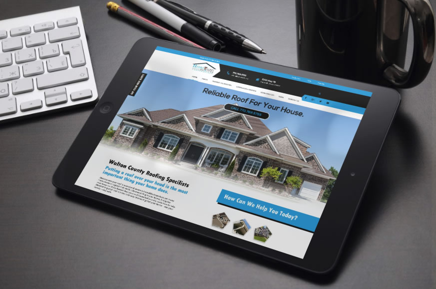
We Welcome Hydro Tight Roofing & Restoration to the EIS family! Hydro Tight Roofing is a family-owned roofing & restoration company located in Loganville, Georgia. They are members of the National Roofing Contractors Association, Master Shingle Certified through CertainTeed, with outstanding reviews on both Kudzu and Angie’s List. They work with new construction, developers, home builders, and homeowners. After taking a look at their current website you will see below we came up with some problematic issues that we wanted to focus on and correct in the newly designed and developed website. The logo looks like it’s just been slapped on the website. It does not blend in well with the site design/layout Load Time – Every single page takes a while to load. 14seconds is what the load time on a 3G service is which is poor and leads to 32% Estimated visitor loss. Navigation is difficult to read No call to action up top Facebook links to the incorrect Facebook business page Google+ links to the incorrect google page Sections on the home page are just plain and not eye-catching. The gallery of work does not show past jobs. Frequently Asked Questions is text-heavy. The service Area page is not professional looking. Favicon is not correct. Top Fixes For the site Load visible content before CSS and JS – If the amount of data required exceeds the initial congestion window, it will require additional round trips between your server and your visitor’s browser. To make pages load faster, limit the size of the data that is needed to render the above-the-fold content of your page. Optimize Images – Images often account for most of the downloaded bytes on a page. Properly formatting and compressing images can save many bytes of data and improve website performance. Leverage Caching – Caching allows a browser to store frequently requested files on the user’s device for a set period of time. When caching is enabled, subsequent page loads can be more efficient. Performance graded at 12 out of 30 – Page requests are 117 which makes the site slower. SEO – Page titles need to be fixed. Scored 20 out of 30. Security graded at 0 out of 10. No SSL certificate means Google does not give good rankings to site without an SSL certificate. Make a call to action. Incorporate a rewards program. Make the site stand out and draw users in. Make a Favicon that is relevant to your business. Show your work in a professional easy to maintain layout. Share the latest news in a blog to help keep fresh content on your website. Add social share buttons on each page. Brand social media to mirror your website. Our Design Presented to the Client
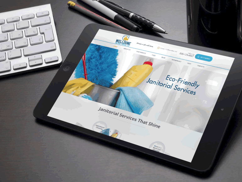
This website design concept has been presented to the client. Welldone Janitorial Services provides cleaning services for Residential & Commercial Business Owners. This concept, when developed, would include the following functions. Responsive/Retina – will be able to re-scale depending on the device it is viewed on. Visual Composer Plugin – which helps make editing easy for the client. Bootstrap – The most popular HTML, CSS and JS framework for developing responsive, mobile first projects on the web. Valid HTML5 & CSS# RTL – Enables a feature in the post editor which allows writing texts in Left-to-right and Right-to-left directions. WPML – WordPress Multilingual plugin Request a date/services Get a Quote form Easily add coupons/edit coupons
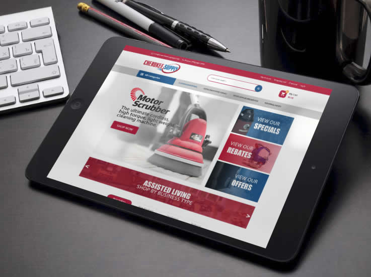
In 2001, Cherokee Supply initially offered janitorial & breakroom supplies that met the immediate needs of their customers. Today, they have expanded their product offerings to include office supplies, facility maintenance needs, and safety products. To keep up with the changing marketplace are developing a new website that will help serve needs of their customers. This will be a full-service website with over 30,000 items available to existing and new customers. To provide quick and efficient access to customers across the United States, CherokeeSupplyGA.com brings a network of over 35 distribution warehouses to one site. Here are some other features we could apply to the site if needed once it’s moved over to the development phase. Mega Menu – Great for the navigation menu and the Categories menu to show links in a nice and neat format. Blog Module – Help customers understand more about your site and your products via a blog. (this can be found in my design concept) Products slider – All types of products (new, featured, best selling, discount, most viewed) are displayed in a slider with a nice design with smooth effects. This can be found in the design concept if you see the circles with arrows under the products right above Latest News) Daily Deals – Display countdown time in every special product page or slider on the home page. Easy to configure within the dashboard. Categories Tabs Slider Ajax Add to Cart Responsive and Retina Ready – All functions of your site will be viewable on almost every device. Desktops, Laptops, ipads, iphones, tvs, samsung. (though sometimes Apple products tend to have bugs so we never guarantee not having issues with apple devices) Product Variants – Allow you to create products with many attributes such as color, size, material, etc. Custom Banner Slider – Simple effects but equally smooth with module slideshow. Brand Logo Slider – you will see this on the design concept at the bottom. Newsletter – Display newsletter form on in the footer or the site which can be easily configured with MailChimp. WordPress 4.8+ Ready WooCommerce Ready – (shopping cart) WPML Supported Social Icon Links Error 404 page Visual Composer – makes editing and maintaining your website easy. Contact Form 7 – Form plugin used on the site once developed.
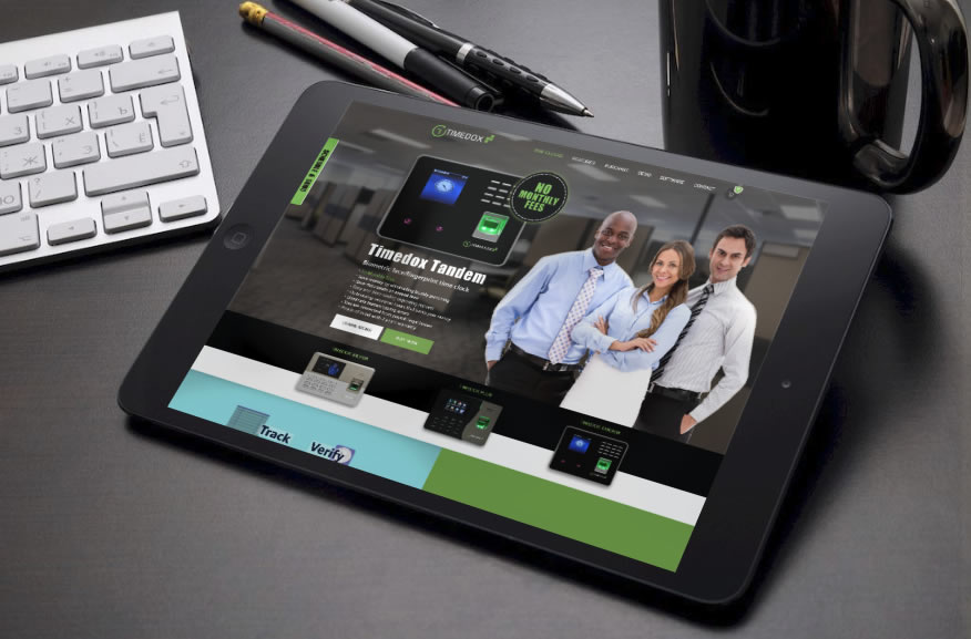
Beginning their journey in 2006, TIMEDOX has been providing time and attendance solutions nationally and internationally for businesses of all sizes; from “mom and pop”-sized joints with only one or two employees to multi-level corporations. Tens of thousands of ever-growing companies record their working hours using our equipment and software, now reaching over 60 million identity check transactions. They had hired another design firm out of India months ago and the end product the other company delivered was constructed in a way that made updating the website for the client not manageable. It had many errors. And was never completed. Timedox came to us here at Elegant Image Studios to get the site they initially visioned to have. A slick, professional, eye-catching, working website. CLICK TO ENLARGE IMAGES
